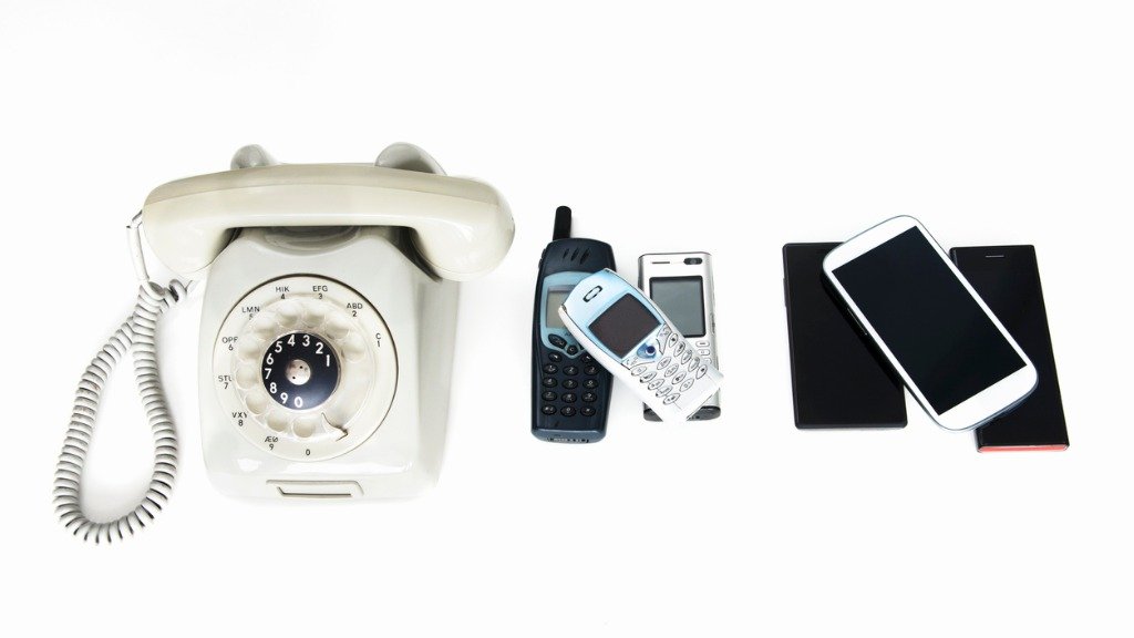
From Complex To Simple: The Evolution Of The Interface

The increasing influence of interfaces in pre-sales, sales and after sales processes is impressive. This evolution is moving fast. It is evolving from complex to simple, and from automated to augmented.
The major technology platforms are experts in developing modern interfaces. They succeed in making the lives of consumers as easy as possible.
This is probably the biggest challenge for companies that don’t have a digital DNA: making interfaces of the same quality and with the same benefits as the major platforms.
In the past, all interfaces were complex. Some people say that they are still too difficult from a technological perspective, but that’s just not true. It was only really difficult back in the 1980s and 1990s.
To work with MS-DOS, you needed to be a half-nerd. Today, technology has never been simpler. The iPhone was the first technology product without a help function and an inch-thick instruction manual.
Since then, the world has been treated to a wave of new interfaces that are getting less and less complicated all the time.
They have to. If something is too complex for the consumer to use it easily, it simply won’t be used. End of story. Consumers usually give a new app 30 seconds to prove itself.
If they don’t understand it within those 30 seconds, it will be ditched. That’s how quickly customers make judgements nowadays.
In recent years, we have seen the arrival of the one-button interface. Apps that allow you to order a pizza with just a single press of a button. Apps that allow you to order a car with just a single press of a button.
Amazon Dash buttons work the same way: just hit the button to buy a new supply of coffee, washing powder, etc. When the Tesla 3 was launched, the Tesla website also had a single button with a single capitalized word: BUY.
Simplicity has become the new norm. Like most norms, it can sometimes be taken to extremes, so that you occasionally see ‘one-button’ interfaces in almost ludicrous situations. In Singapore there is a ‘dispenser’ where you can buy a luxury car.
It looks a bit like a bread machine, but is the size of a small apartment building and instead of being filled with fresh loaves, it is filled with Porsches, Ferraris and Lamborghinis. At the bottom, there is a single button.
You press it, pay a few hundred thousand dollars with your credit card, and out pops your brand new car. What could be simpler?
From simple to automated
The next step is the evolution from the ‘one-button’ to the ‘zero-button’ interface. When this happens, customers will no longer need to do anything at all, not even press a button. Everything will be fully automatic.
Both smart central heating systems and the automatic rebooking of missed air flights are good examples of ‘zero-button’ applications. So too is the new Starbucks App, which allows customers to give their orders verbally.
The bot sends the order to the relevant shop, so that the coffee is ready when the customer walks through the door. Payment is also made automatically via a mobile app. All handsfree. Not a single click involved.
Without the need to wait a single second, the customer has completed a perfect transaction with Starbucks. And this is what today’s consumers expect. In a world where time is the consumer’s scarcest resource, every second counts – which makes this kind of interface worth its weight in gold.
Amazon Go is an offline retail experiment. Amazon has opened a test store in Seattle where everything works via automatic interfaces. The customer scans his Amazon app when he/she enters the store.
He/she then selects the goods he/she wants from the shelves, puts them into his/her bag and leaves. The products are not physically scanned and there is no cash desk.
You just walk in, take what you want, and walk back out again. At first, it almost seems like shoplifting, but payment is fully automatic.
Amazon has not yet revealed how this system works, but experts think it must be based on data analysis from the combined input of sensors and camera images. But the technology is not the most important thing. The impact on the customer is what really matters. And that impact is huge!
Amazon Go has removed all the aspects that people don’t like about shopping. Queuing, putting your purchases on the conveyor belt, paying, putting everything away in carrier bags: this has all been eliminated from the process.
The focus is just on one thing: shopping. Imagine what it would be like if airports adopted a similar approach! Let’s assume it is possible for the airport to link your boarding pass to your credit card.
As soon as you have scanned in your boarding pass as you enter the airport, the shopping can begin. You fancy a sandwich and a beer? No problem! Just take them and go. No queuing. No paying. Something to read on the plane? Same story.
Something from duty free to take home for your partner? Ditto! You don’t need to be a management genius to work out what this will do for the total turnover of the airport’s retailers.
If a passenger has little time before his flight for a sandwich and is faced by a queue of a dozen people, he will buy nothing. With the Amazon Go model, there is no queuing – so the passenger will almost certainly buy something. And something is always better than nothing.
Prof. Steven van Belleghem is an expert in customer focus in the digital world. He’s is an award-winning author, and his new book, Customers The Day After Tomorrow, is out now. Follow him on Twitter @StevenVBe or visit www.stevenvanbelleghem.com


